Inspirational Magazines:
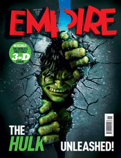
The two Empire magazine covers, captured our attention significantly this because they used a extreme close up of their main characters as the center of attention. This helped build upon our idea of having Riann, who plays the main character in our teaser trailer, being the center of attention similar to the Empire magazines.
This was because Riann was the main character, and if it was a real life magazine article she would create more audience attention, being a well known acteress and therefore the main character of a movie we are trying to promote, so that is why we used the positioning of the characters as inspiration for Riann to be in front of the headline and the texts on either side of her. The empire magazine based around Hulk however used to much of the main image as their magazine, whereas our idea wanted more writing around the sides. |
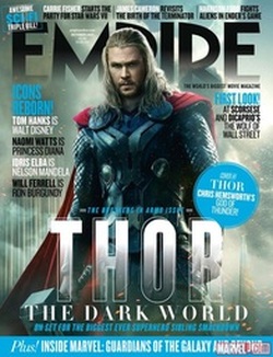
The Empire magazine for Thor aswell as the one of Hulk used the main character on the magazine article, this idea therefore linked with ours, the background colours and the headlines, aswell as the taglines, and the information on either sides, this gave us the idea to change our background , instead of being all white, we wanted to make a slight link with our genre, as Empire magazine reflects the genre of the Thor movie, being action, we to wanted to reflect our mystery/Thriller genre but not give the trailer away. Therefore our final idea was based around Riann but not in character, Therefore, becoming more 'exclusive' therefore connotating a magazine article as we would also add in 'exclusive chat with Riann flora' to make the magazine article look more realistic and make it something the audience would want to buy.
|
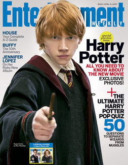
This Entertainment weekly magazine was the main magazine cover we chose for inspiration. The Magazine fonts, headlines, and picture was exactly what we wanted to portray in out magazine cover. The large image of this character on the magazine was shown in a close up but the information on each side is still added and structured effectively. Although this character is shown in character, through his characters costume, we wanted to do the opposite and show Riann who was the main character, not in character, Making it more lighthearted and not giving to much away about our teaser trailer through the magazine.
Although we were going to, like the empire magazine, pick a suitable colour to connotate our specific genre. Because our teaser trailer is based around three girls, we wanted the magazine to be slightly lighthearted to reflect my actual personality and not in character, so the audience would be more interested in finding out the character Riann play in the teaser trailer as well as what she is like out of character. This therefore gave the audience the idea that Riann is a well known, or an upcoming actress who they all need to learn about as she is going to be a big star very soon. The idea that the magazine should have an 'exclusive' feel to it is likely to an attract the audience as it would make them more interested in finding out detail not everyone else knows. |
Draft Magazine Ideas:

|

|

|

|

|
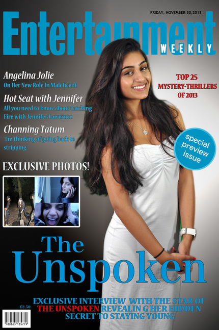
We decided to go with 'Entertainment' magazine. Out of a variety of photos of Riann who is the main character, we finally chose this one because she is smiling and out of character which is exactly what we were aiming to go for. We started experimenting with different coloured backgrounds, at first we thought we could choose blue as it is a bit of a neutral colour however, we didnt feel that it looked right as the magazine title is also in blue it would make the writing too hard to read. It also gave off the impression that Riann was too innocent and almost angel-like which wasnt what we were going for. We then started experimenting with a mixture of a black and white background. Shes wearing a white dress which connotates that she is a very innocent individual however, the black and white background connotates the two different personalities she has. The black is for the character she played in The Unspoken as the character was a murderer however the white connotates that she is quite innocent and pure hearted deep down. Her hair is out and wavey and not tied back which gives the impression that this is a very glamarous photoshoot and that Riann is out of character as the way she is dressed and her facial expressions are completely opposite to the ones she has in the teaser trailer.
Final Magazine Cover:
Inspirational Posters:

POSITION:
The Roommate inspired us to have all of our main characters on the poster, so unlike the magazine that just showed Riann, the poster would show the three main characters however positioned differently. The positioning of the three characters in The Roomate poster gave off the impression that it was the two characters on the left against the one on the right as she is alone and behind a door compared to Vazma and Serena. The roommate poster then inspired us to think of other shots involving the three of us, linking to our main dialogue 'Have you ever tried to keep a secret? COLORS: We examined different film posters produced for 'The Roommate' The two main and distinctive colors used in this poster stood out for us. The color scheme of red and black, similar to our final poster where we have also used this color scheme. Black and red suggest death and danger. There is a slight tint of orange and yellow on each of the characters suggesting some sort of hope and ambition, each of them hold. These colors are very eye catching and grab the audience's attention. Also, the mixture of white, yellow, red and black background color behind each character emphasizes on the danger and suspense of the movie. COSTUME: The antagonist is dressed in white, whereas the protagonist's love interest is dressed in black. This gives out a different message about the characters compared to the actual story line. Therefore, the color worn by the characters subvert the conventional image portrayed in other movies. PROPS: The only prop used in this poster is the door which separates the three character suggesting that it is good vs evil. Perhaps, the door can connote it is the only thing protecting the protagonist and the love interest from the antagonist. So, the door is protecting her from danger. TITLES: The title for 'The Rommate' is the main focus of the poster, especially the 'Roommate' engaging the audience straightaway. It is important for the audience to know the name of the movie in case they are interested. The tagline 'Murder can really ruin a friendship' intrigues the audience and making them ask questions such as: what murder? which friendship? does anyone actually die? Therefore, the tagline has achieves its sole purpose to attract the audiences attention. Even though, the tagline and the title are within the color of the black and red color scheme it still stands out. The name of the actors are on the top of the poster above the title, not dominating the whole poster still keeping the main focus on the title and the characters. |

The Apparition reflected our idea of our teaser trailer within the story line of having three friends and a secret. The hands covering the mouth gave us the idea of having Serena and Vazma having our hands over Riann's mouth to emphasis the fact that Riann is the one who is struggling to keep this secret and is becoming a liability towards the friendship group.
POSITION/ BLOCKING: The first and most important thing is that the male character is at the front, holding the weapons and is right in front of everyone else that is on the poster, this could suggest his position within the group and shows that he is the most important and dominating. There also seems to be a lot more men on the poster than women, there are only 2 women and the rest are men, this shows a more stereotypical view in the sense that the men are more stronger and at the top .This also represents that the women are outnumbered and gives that sense of survival of the fittest and if the women is able to survive, especially when majority of the contestants are men. The most important thing is that the main character is blocking the other characters who are covering her mouth and have a firm grasp over her mouth. COLORS: COSTUME: PROPS: TITLE: |

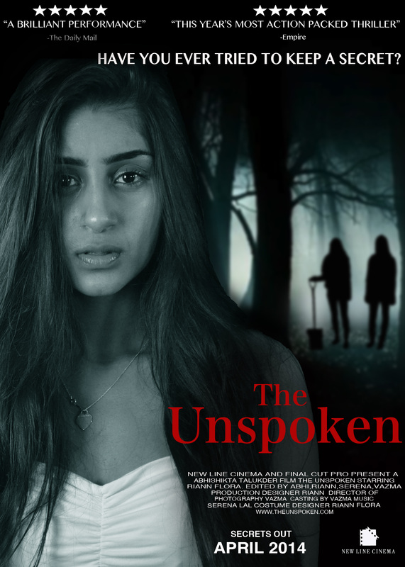
Eden Lake become our main inspiration. The poster is set in a forest where the girls from the teaser trailer buried the body of the person they murdered. It shows a girl looking terrified hiding behind a big tree from people in the forest whose faces we cannot see as they are in silhouette. The colors used in this poster mirror the colors that were shown in our teaser trailer which is a very black/blue color theme. The title being in red could symbolizes the bloodshed.
POSITION: COLORS: COSTUME: PROPS: TITLE: |
We didnt want to copy the roomate exactly so we changed the idea up a little bit and had Riann in the middle and Serena and Vazma telling her to "shh" as the three of them are trying to keep a secret but Riann has been panicking a little too much and it seems to us that she is going to expose us all about what we have done (committed a murder). Serena and Vazma had to give off a bit of an angry facial expression as we are angry at Riann who feels as if she is unable to keep the secret any longer and Riann with a very scared/distressed facial expression as she is confused at what she should do. We really liked The Apparition poster as it could give off a similar message that we wanted ours to give off; Riann being forced to keep a secret. We thought that if the three main characters of the teaser trailer were in it with Vazma's and Serena's hand over Riann's mouth (us having an angry facial expression and Riann looking confused) it would put across the main plot of the 'movie' or teaser trailer.
They also tried having the three of us standing in the order of dominance we have over one another, so Serena and Vazma were closest to the camera, Vazma's arms were folded while Serena was holding the shovel which is seen in our teaser trailer and dressed in dark colours which connotes that they are the more 'evil' ones in the group. Riann is positioned behind us with a very innocent facial expression wearing all white which also works with the 'innocent' look we were aiming for. We took pictures of Riann on her own. She had to give off a strong impression that she was confused/distressed/terrified. We purposely wanted her to wear white, symbolising that she is innocent/pure. Her hair wasn't tied back or tamed which we were hoping for would come across as if she isn't 100% innocent as she was the one who committed the murder in the first place. Serena and Vazma took pictures separately, we wanted a long shot for ourselves as I was influenced by the Eden Lake poster the most and wanted to mimic the silhouette people in the background. Vazma was holding the shovel while Serena stood in a strong standing position which would look good when we edited it on Photoshop. We experimented with a range of photos and positions and at the end we really liked the Eden Lake poster and decided that the pictures for that interpretation were the best also.
They also tried having the three of us standing in the order of dominance we have over one another, so Serena and Vazma were closest to the camera, Vazma's arms were folded while Serena was holding the shovel which is seen in our teaser trailer and dressed in dark colours which connotes that they are the more 'evil' ones in the group. Riann is positioned behind us with a very innocent facial expression wearing all white which also works with the 'innocent' look we were aiming for. We took pictures of Riann on her own. She had to give off a strong impression that she was confused/distressed/terrified. We purposely wanted her to wear white, symbolising that she is innocent/pure. Her hair wasn't tied back or tamed which we were hoping for would come across as if she isn't 100% innocent as she was the one who committed the murder in the first place. Serena and Vazma took pictures separately, we wanted a long shot for ourselves as I was influenced by the Eden Lake poster the most and wanted to mimic the silhouette people in the background. Vazma was holding the shovel while Serena stood in a strong standing position which would look good when we edited it on Photoshop. We experimented with a range of photos and positions and at the end we really liked the Eden Lake poster and decided that the pictures for that interpretation were the best also.
Draft Poster Idea:

Final Poster: